Perspectives | COVID-19

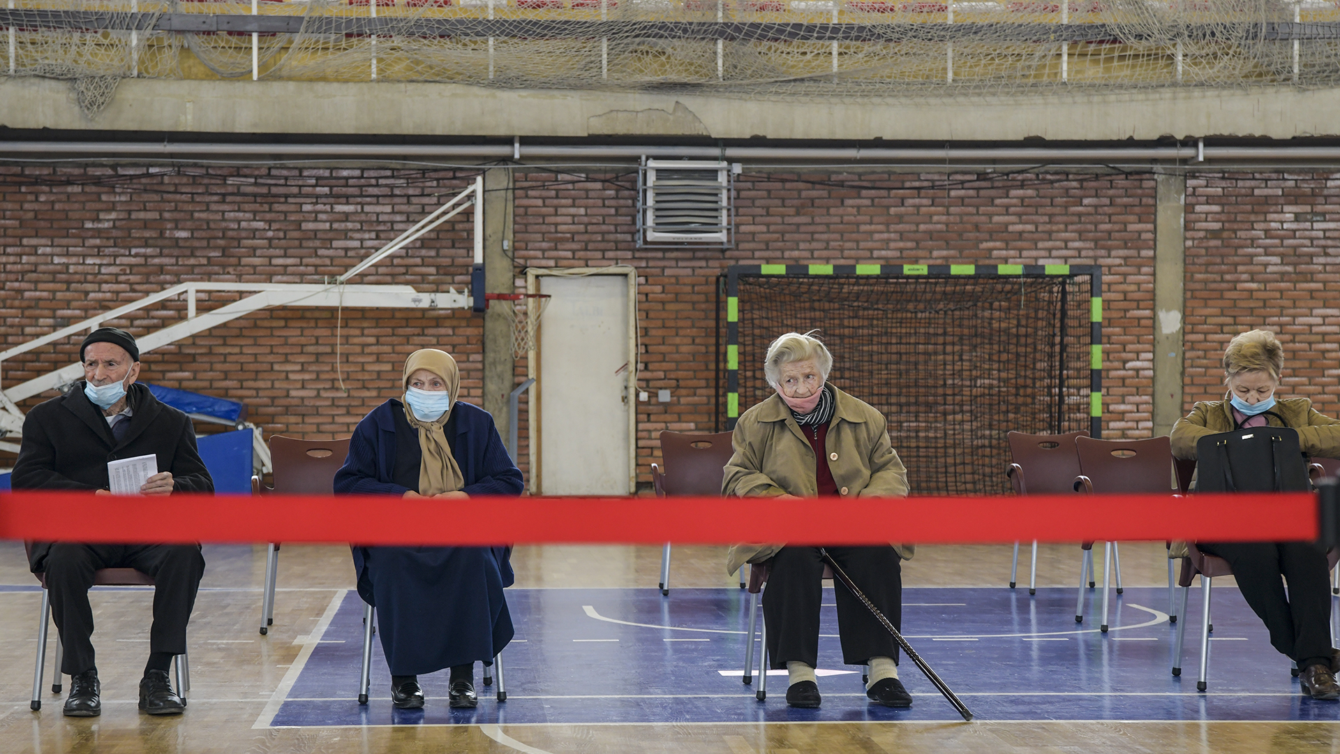
It’s time for transparency in Kosovo’s COVID-19 numbers

By - 16.04.2021

The current data is incomplete and lacks relevant context to be meaningful.

On February 14, then Minister of Health Armend Zemaj announced that day’s COVID-19 figures on his Facebook page. He proudly revealed that there had been a record number of tests conducted, the test positivity rate was the lowest yet and there had been zero deaths for the first time in months.  

A look at the broader official daily figures showed that the number of new reported positive cases — which had been rising steadily — had now plateaued, while the number of reported deaths was in decline. According to the numbers, things were looking up. 

But Zemaj’s post was met with widespread derision and scorn.

That’s because — as most people reading this will know — the account above omits some fundamentally important contextual information. 

February 14 was not just any old day, it was election day. The preceding weeks were not regular weeks, they contained official and unofficial election campaigning with political parties gathering hundreds of people, often indoors with limited physical distancing and with few masks in sight. The apparent improvement in the data wasn’t coming at a time of enhanced restrictions or increased caution, but at a moment when restrictions had been eased and bars were full. 

Later that day, Zemaj would find himself faced with more record-breaking numbers, as the incoming election results revealed a humbling defeat for his party and Vetëvendosje swept to a landslide victory.

There are basic, everyday steps that the new government should take to demonstrate it is ready to handle the pandemic with transparency.

Vetëvendosje’s winning campaign, which saw it secure more votes than any party in Kosovo’s electoral history, promised a new way of governing with accountability, rule of law and justice at its heart. Newly elected officials have regularly repeated grandiose statements about serving the citizens who have placed so much trust in them and how they will bring transparency to institutions.

There is a long way to go, and the administration’s slow and bumbling start to dealing with the rapidly deteriorating public health emergency was an inauspicious start. Introducing fresh restrictions to try and curb the spread of the virus only at the point when hospitals were approaching full capacity was waiting until the latest possible moment, and the two-week delay in taking action after coming to power will have cost lives. 

A final decision still needs to be made on what restrictions will be in place after the current restrictions expire on April 18. But there are also more basic, everyday steps that the new government should take to demonstrate that this is a serious administration that is truly ready to handle the pandemic with transparency. 

One of those is rapidly increasing the quality of the information it provides. 

‘Don’t believe the numbers’

It is clear that after years of those in power taking the people they serve for fools, Kosovo’s citizens have little faith in any information provided to them by institutions. This is particularly true when it comes to numbers. 

Even before the election campaign, the most common response to any mention of COVID data was “don’t believe the numbers.” 

Much of the issue comes down to trust. Without citizens trusting that they are being given an accurate picture of the scale of the problem, they are not going to believe that the government, or anyone else, can be trusted in the solutions they are offering. 

Whether the solutions are temporary such as restrictions and other preventative measures, or longer term such as the roll out of the vaccine (when it becomes more widely available), if citizens don’t buy into them then the route out of the pandemic will be much slower, and much harder.

Numbers, just like everything else, require context for full understanding.

But when it comes to building trust through transparency, this comprises a lot more than simply making public a few numbers. 

Since the early days of the pandemic, Kosovo’s institutions have released plenty of numbers relating to the COVID-19 situation — much of it on a daily basis on the Facebook page of the National Institute of Public Health (NIPH). The NIPH also has a dashboard on its website, where it regularly updates various data on the number of tests, positive cases, recoveries and deaths. 

The main issue is not therefore with providing information in the first place, as it is with providing information that is meaningful. Because numbers, just like everything else, require context for full understanding. 

This comes in two stages. 

The importance of definition

Firstly, those providing the data must provide technical explanations on the data itself. This provides the data with some rigidity and means that those trying to interpret the information or hold decision-makers to account have a starting basis from which to work.

To draw a comparison, in the UK, the official COVID data is accompanied by a webpage with over 8,000 words of explanation — saying how the data has been collected, when, and by which institution. It has precise definitions of each term, and information on what is included by it, as well as links to further documents with an even more detailed level of technical explanation.

For example, when it comes to COVID-19 deaths, the information explains that the UK government generally refers to “deaths within 28 days of a positive test.” It adopted this standard definition on August 12, 2020 after the death toll reported in England had previously included all deaths that followed a positive COVID-19 test, regardless of the time that had elapsed between the two. The technical information also explains that the numbers initially reported only included those who had died in hospitals, whereas this was expanded on April 29, 2020 to also include those who had died elsewhere such as in private homes and care homes.

At this stage in Kosovo we would settle for any definition of the terms used.

Now, analysts can — and do — argue about which definition should be used to provide the best picture of events. The UK Office of National Statistics reports a higher death toll than the Department of Health and Social Care because its definition includes any death where COVID-19 is mentioned on the death certificate. This is based on clinical assessment by doctors and not necessarily whether the person had tested positive.

The “deaths within 28 days of a positive test” definition, on the other hand, does not report the cause of death, and — as explained in the accompanying notes setting out the data’s limitations — “as such represents deaths in people with COVID-19 and not necessarily caused by COVID-19.”

Other countries have their own defined methods of how they count COVID-19 deaths.

But at this stage in Kosovo we would settle for any definition of the terms used, as a starting point.

For example, is a “case of death that is SARS-CoV-2 positive” — as reported by the NIPH in its daily Facebook posts — one where the virus has been assessed by a doctor as the definitive cause of the death? Does this number include people who were confirmed to have had the virus when they died (or within a certain period of time of their death), but who may have died from other factors? Does it mean any person who is merely suspected of having the virus when they died (or within a certain period of time of their death)?

Is there even a single definition used? Or has the definition used changed over time, or from hospital to hospital, or even doctor to doctor? 

Skeptics may suggest that the answer is probably some combination of all of the above, and we have all heard people with their own theories on how these numbers are being inflated or repressed. But if we can begin to identify exactly what point we’re starting from with the data, then at least we know how to focus our efforts on trying to improve the situation.  

These “Active” and “Recovered” numbers are currently effectively meaningless.

Similar issues arise when it comes to “Recovered” cases and “Active” cases, which are lazily rolled out by many media who effectively copy-paste press releases or social media posts.

But how are “Recovered” and “Active” cases measured? 

Is everybody systematically re-tested after initially testing positive until they display a negative result? It is clear from speaking to those who have had the virus that this isn’t the case. 

Are these numbers based on the re-testing of only those who have been hospitalized with COVID-19? If so, how are those who do not require hospital treatment accounted for in these numbers — do they remain “Active” cases forever?

Or is there another criterion being used to make this assessment? Perhaps a certain period of time having passed since a positive test? 

Unfortunately, without any accompanying information or explanation, these “Active” and “Recovered” numbers are currently effectively meaningless.

When asked for further information on the COVID-19 data they provide (before the change in administration), both the NIPH and Ministry of Health failed to respond.

What’s the context?

The second form of context required is the wider context in which the data must be read. This means interpretations from the institutions’ scientists on what the data means. And it means explanations about both how policies such as restrictive measures may be impacting the data and how the data is being used to inform policy-making decisions. 

Until now, official interpretations and analysis of the data have been largely lacking and have rarely gone beyond generic assertions or appeals. When ministers and institutional heads have referred to COVID data in front of the cameras, it has tended to involve simply reading out figures from the past 24-hours. 

This not only places undue emphasis on a particular day’s numbers, which for an array of reasons are often less relevant than broader trends, but it also offers little assistance in helping viewers to understand the significance of the data or what it might mean.

For example, the number of new reported cases had been rising steeply since the end of February but during April has been in decline. The average daily number of new reported positive cases was well over 800 at the start of the month but is nearer 500 now, while the percentage of tests that are positive has also fallen from an average of over 20% to 14% in the same period.

Scientists elsewhere have repeatedly made clear that the numbers do not reflect changes until a period of time after they have been made.

However no official explanation has been given as to what the government and their scientists attribute the decrease in new cases to.

This trend began slightly before the tighter restrictions introduced on April 6, whereas scientists elsewhere have repeatedly made clear that the numbers do not reflect changes until a period of time after they have been made. 

Likewise, with the first vaccine doses administered on March 28, it seems too early for vaccinations to have started having a noticeable impact on case numbers — particularly since the percentage of the population vaccinated is still infinitesimal.

Could there be some connection between the current dip in positive cases reported and the recent public holidays? Is the recent trend in fact a sign that people who suspect they may have the virus are not getting tested? 

Or could there be a technical explanation for the change, perhaps a change in the approach to testing policy? 

Here, again, we are left guessing because we have not been provided with details such as how many tests are being conducted in different locations across the country, what percentage of tests are being carried out on people suspected of having the virus, and what percentage are carried out systematically (for example on medical staff, or staff in institutions, etc.).

As it stands, we simply don’t have enough quality information available to provide any meaningful answers. Instead, we all make up our own minds based on our individual experiences and whatever anecdotal information we may have picked up in conversations with those we happen to have spoken with recently.

Holes in the hospitalization data

Unlike with the total number of tests, positive cases and deaths, when it comes to hospitalizations, we have not even been provided with regular data. This is a crucial obmission, because one of the key aims of introducing preventative measures in an effort to “flatten the curve” of COVID-19 cases has ultimately been to prevent health care facilities from becoming overrun. 

In recent weeks, there has been a notable improvement in the regularity with which hospitalization data has been published, with SHSKUK now publishing virtually daily updates on its Facebook page — though technical explanations and relevant context are still missing.

But until late March, finding published hospitalization data required trawling through various Facebook accounts — including that of SHSKUK and the personal page of the NIPH spokesperson — to manually extract information from ad hoc posts. 

Without consistently available data, it is significantly harder to spot trends, and virtually impossible to scrutinize, hold to account or to offer potential solutions.

There were also regular periods when no data was available. In the month of February 2021, in the build up to the infections peak we are currently experiencing, partial hospitalization data was published on just four occasions. During the peak of infections in the winter there was a period of 16 consecutive days when no hospitalization data was published at all.

Without consistently available data, it is significantly harder to spot trends, and when there are big gaps, as in these cases, it is virtually impossible to scrutinize, hold to account or to offer potential solutions.

Verbal statements from institutional spokespersons or ministers, such as in the previous administration’s daily COVID press conferences, are not sufficient. 

The NIPH’s COVID-19 dashboard includes various data sets, but no technical explanations. With only one timestamp for the whole page, it is also unclear when data relates to, since it is not all updated with the same regularity.

Nor is the NIPH’s current COVID-19 dashboard. This only displays the latest hospitalization numbers with no historical data for comparison; while the page’s single timestamp indicating when data was last updated lacks precision to allow visitors to know which of the various datasets was updated on the day stated.

Again, when it comes to transparency, it is not enough to simply say you have provided the information — the method and consistency of communication is also key.

Quick wins to turn the tide

Whether the data is there, but lacking detail or contextual information, or whether it is missing in the first place, the impact is the same. People are left seeking their own answers, and coming up with their own explanations, which it is in turn virtually impossible for anybody else to disprove. We are, therefore, left in the situation where conspiracy theories abound.

Armchair analysts (and others who should know better) pluck whatever number happens to support their point of view, usually overlooking the natural day-to-day fluctuations that are witnessed in COVID-19 data everywhere around the world. And rather than societal discussion and critique taking place based on sound analysis of quality data, those whose job it is in the media and civil society to hold the government to account all too often end up being dragged down to the level of whatever information is available, thereby only adding to confusion and mistrust. 

In order to turn the tide, the new government must focus on rapidly increasing the quality of the COVID-19 data it provides. The task will only get harder as new variants of the virus and the start of the vaccine roll out program demands transparency around more — and more complex — data, beyond what has been provided to date. 

It will inevitably take time for people to begin trusting the information that is disseminated by Kosovo’s institutions.

As a starting point, the new administration should ensure that all of the COVID-19 data it provides is accurate, consistent, and crucially — contextualized. That means publishing technical explanations of all data already available. 

And it means holding regular press conferences with government scientists, as well as politicians. This doesn’t mean a return to the previous administration’s daily bulletins, but elevating the level of information provided whereby the experts explain broader trends to help offer reasoned interpretations of what is happening in real time. 

After years of government opacity, and amidst increasing public skepticism in relation to the pandemic, it will inevitably take time for people to begin trusting the information that is disseminated by Kosovo’s institutions. But for a government that has come to power with the promise of doing things differently, these are quick and effective easy wins. 

Feature image: Atdhe Mulla / K2.0.